Hi, Patti here with another Scrapadabadoo design team project. When Carol asked us what our favorite new Bo Bunny collection was I immediately answered with Somewhere in Time . I just love the blue, yellow, brown color combination…I think it’s my favorite color combination although I don’t think I realized it until I was working with this gorgeous collection.
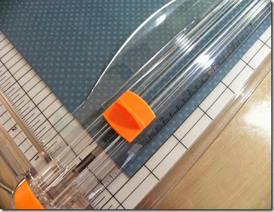
I started with matting my 12 x 12 background pages using the perfectly coordinated cardstock sheets but because I have been known to be somewhat of a hoarder, even though I just call it frugal, I gutted the back of 2 of the mats. What I did was cut out the centers leaving a 1” border. This leaves me with some smaller squares that I can use for photo mats or making embellishments or whatever.
Working from the back upwards, this is my third layer. I first cut 1/2" from one horizontal side and 1/2" from one vertical edge, then cut out a square leaving me with a 1" border. I ended up with a 10 1/2" square remaining to use for future embellishments or matting. You will see in a photo below that I chose a yellow piece of paper for my 2nd layer from the bottom. I trimmed a 1/4" off of one horizontal edge and 1/4" off of one vertical edge which I then gutted out a square leaving a 1" border which left me with a 10 3/4” piece of paper for future embellishments.
I chose a piece of white cardstock as the top layer of my layout so all of the other elements would pop off the page, but I thought it needed a little something to add interest so I stamped a border using the wood grain edge stamp from Kaisercraft in Coffee Archival ink from Ranger
Before I adhered them all down, I distressed all the edges with the Prima Distressing Tool because I just can’t help myself.
Once all of these layers are adhered, you will have a 1/8" border or mat all around on all 4 layers. I love the matted look on a page as I think it brings depth and dimension without adding too much bulk. I need to save room for all the fun stuff like embellishments…tee hee hee.
Next is to anchor my photo. I chose this section of the paper from this collection cut to 8 1/4" x 5" matted on a piece of a dark brown cardstock and added two strips cut to 8 1/8" length of punched borders to the bottom to bring the background layers to the photo for a cohesive look. This is where the leftover gutted pieces of paper come in handy. By using the scraps,I don’t have to cut into a perfectly good sheet of 12 x 12 cardstock for some embellishments. I used the Martha Stewart eyelet lace edge punch to add interest.
Using a 4 x 6 photo double matted, I then decided on the placement of my photo mat and chose towards the bottom was best since this was the largest element on the page and thought it would be too heavy to put in the upper section of the page. I could have placed it in the center but then I wouldn’t have room for my embellishment cluster I had planned to balance out the page.
Here’s a little trick I like to do…I use a scrap piece of chipboard to mount my photo on just in the center of the photo so I can tuck embellishments under the photo after I’ve adhered it down.
I also do this to embellishments which you will see I did to the balloon.
Here are the embellishments I chose to complete my page. The circle is an old piece of lasercut chipboard that I’ve had in my stash forever from back in the day when everyone was on a naked chipboard buying kick…well, maybe not everyone, but I certainly was and I have enough naked chipboard to open my own store. But since I have no plans to open a store, I decided to try and incorporate a piece in every future project, Wish me luck…
The remainder embellies are from the BoBunny Somewhere in time collection. I just adored the vintage baby stroller and immediately knew what photo I was going to use in order to be able to incorporate it into my layout.
BoBunny Noteworthy
BoBunny Buttons
BoBunny Noteworthy
BoBunny Buttons
Also notice one of my layering embellishments is the packaging...yup, you read right....the packaging was beautiful in the collection so don't throw away your packaging...use it!!
I completed the page by adding some of the jewels from the collection.
Thank you for having a look. ~Patti~


Patti, I do the same thing for several reasons: I hate to waste beautiful printed paper when all you can see is a tiny bit of it; the pages/projects/cards become too heavy if there is too many layers on the card; I have to be frugal. Your page is beautiful....love the clean and simple look that is jaw dropping gorgeous!
ReplyDelete